Popular task management service Todoist has been hard at work on a new brand identity and a revamped web app. These two updates bring feature and design parity between the iOS, Android and web versions of the service.
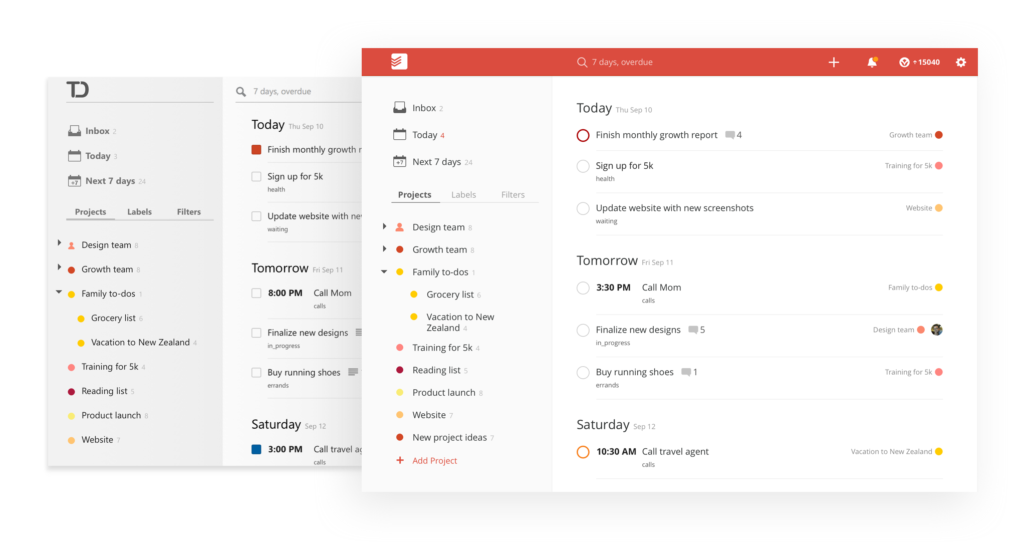
When it comes to the web app, the company has revamped the interface to make it a bit more modern with more whitespace and a flat design. The tick boxes are now round, and there are some subtle animations when you hover over icons. It looks more like the company’s iOS and Android apps, which is not a bad thing.
Todoist also added natural language processing. Previously only available on mobile, this feature lets you add tasks with due dates in a single sentence. For example, you could write “Take out the trash every Sunday,” and Todoist will create a recurring task called “Take out the trash.”
While natural language processing is particularly useful on mobile, bringing feature parity avoids confusion when you try to do something on the web and it’s only available on mobile. It is worth noting that this feature works in 14 different languages.
Todoist also updated the search feature on the website with realtime result preview. After typing a couple of letters, the search bar suggests tasks, projects and labels in a dropdown menu so that you can jump right to what you were looking for without having to load a search result page first.
Another small feature, it’s now easier to add comments to a task as you don’t have to create a task first and then add comments. And the website is responsive, letting you load the web app even on a mobile phone.
Disrupt 2026: The tech ecosystem, all in one room
Your next round. Your next hire. Your next breakout opportunity. Find it at TechCrunch Disrupt 2026, where 10,000+ founders, investors, and tech leaders gather for three days of 250+ tactical sessions, powerful introductions, and market-defining innovation. Register now to save up to $400.
Save up to $300 or 30% to TechCrunch Founder Summit
1,000+ founders and investors come together at TechCrunch Founder Summit 2026 for a full day focused on growth, execution, and real-world scaling. Learn from founders and investors who have shaped the industry. Connect with peers navigating similar growth stages. Walk away with tactics you can apply immediately
Offer ends March 13.
And then, there is the rebranding. Todoist has been around since 2007. It first started as a side project and evolved into a service used by millions of people. The previous logo was very reminiscent of Microsoft Office’s old icons. In other words, it wasn’t very trendy.
Now, Todoist has a flat logo with bright color themes on mobile and desktop. The new logo features three checkmarks, and it’s also going to be the app icon going forward.
Overall, Todoist added some useful features, such as natural language processing, and made the web interface more polished.
![]()