A very smart project is underway by a 21-year-old design student in Los Angeles. The goal: update Microsoft’s branding and messaging in three days.
Judging by the reaction, Andrew Kim has hit a tap root of opinions out there. So far, there are more than 188 comments on Hacker News about his speculative design project.
Microsoft is that company we love to hate but so want to make better. It’s evident in Kim’s initial posts that he, too, wants Microsoft to be something , something better. First, though, he makes a disclaimer that in itself is a reminder of the classic warning messages we grew up seeing on Marlboro ads and billboards. (See it in the fine print below)

Kim’s spec redesign starts by setting the tone. Microsoft is corporate and conservative. It’s outdated. Gaming and Kinect represent the company. That in itself is interesting. Microsoft’s DNA is in the enterprise. Its Office products set the tone for the age of the IT empire. Not anymore — that’s the past. He contrasts Microsoft to Apple and Google. He says Apple is about design and engineering. It’s huge and controlling. It’s friendly and easy to use. He writes: “Google is the search engine, right?” Ha! “Don’t be evil,” he writes. It’s a “great place to work,” round out his descriptions.
For Kim, Microsoft needs to counter Apple and Google’s friendly advertising with bold branding that shows it represents the future.”Be science fiction.”

Disrupt 2026: The tech ecosystem, all in one room
Your next round. Your next hire. Your next breakout opportunity. Find it at TechCrunch Disrupt 2026, where 10,000+ founders, investors, and tech leaders gather for three days of 250+ tactical sessions, powerful introductions, and market-defining innovation. Register now to save up to $400.
Save up to $300 or 30% to TechCrunch Founder Summit
1,000+ founders and investors come together at TechCrunch Founder Summit 2026 for a full day focused on growth, execution, and real-world scaling. Learn from founders and investors who have shaped the industry. Connect with peers navigating similar growth stages. Walk away with tactics you can apply immediately
Offer ends March 13.
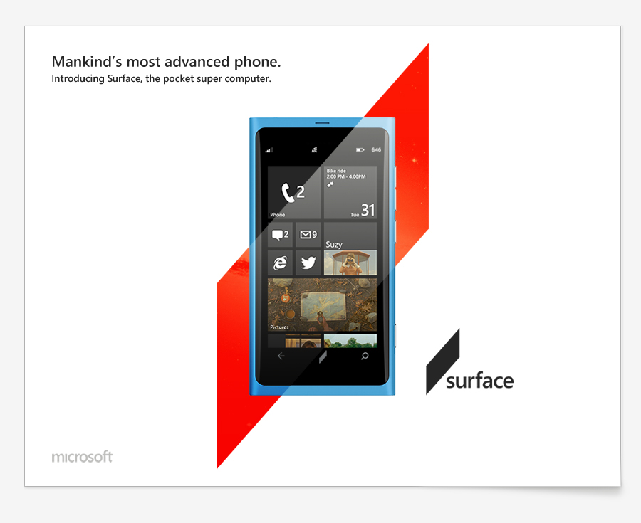
Funny, Kim sees Microsoft as square when it should be slate. Does he know about Microsoft’s former “Slate,” brand? Regardless, Kim’s branding is modern. It’s flexible. And it’s not Windows.
Windows is over. It’s outdated. It represents the past. Windows Phone and Surface are hindered by the Windows brand. Here’s what he visions instead.

I like it. It is more modern — fitting of a younger generation.
Most of all, I love this initiative. It’s how the modern enterprise will be shaped. Out in the open, where we share our talents, critiques and ideas.
Steve Ballmer, are you listening?