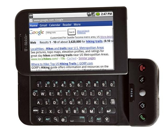
I was so excited when I got my first Palm Treo: I’d be able to browse the Internet from anywhere! That happy moment was soon shattered by the realization that Blazer was a pretty crappy browser. My youthful exuberance was further crushed by the realization that accessing most websites on a 320×240 screen is only slightly better than a root canal. Even now, on my fancy new iPhone 3G, I use the web browser only when absolutely necessary.
Usability expert Jakob Neilsen says Mobile Web 2009 = Desktop Web 1998. He lists a handful of major problems, from slow download speeds (even with 3G), to tiny little viewports, to bloated designs geared for desktop browsers on big monitors. “Using a mobile makes you a disabled user, and we all know that most sites ignore accessibility,” he observes. How true that is.
Although devices will get better, the big advances must come from websites. Sites (including intranets) must develop specialized designs that optimize the mobile user experience. Today, few sites have mobile versions, and those that do are usually very poorly designed, without knowledge of the special guidelines for mobile usability.
Neilsen offers a number of suggestions for improvements. For example:
Moderately rich sites should build two mobile designs: one for low-end cellphones and another for smartphones and big-screen phones. This strategy is especially good if you’re targeting a broad consumer audience with many feature-phone users. The small-phone experience is so different that it needs a dedicated and deeply scaled-back design, whereas the bigger phones benefit from a design that’s mobile-friendly but not bare-bones. Feature-phone browsing is essentially a linear experience, whereas smartphone and full-screen browsing provide more of a GUI experience — albeit through a limited viewport.
Most interesting, though, Neilsen suggests that the best solution is a dedicated application to deliver your content to your mobile users. As smartphones get cheaper and more prevalent, I think this will be the real solution. From a site as robust as Amazon to something drastically more focused like EverNote, I’m much happier to use a dedicated iPhone app to access these offerings than I am to load up Safari to access the actual web site on my phone.
If you’re a web designer, or you manage web designers, please read Neilsen’s comments. I don’t always agree with everything Neilsen promotes, but in this case I’m with him 100%. The mobile web sucks, and requires a different approach from traditional desktop web design.